There was a time when mobile phones were devices used for the sole purpose of making phone calls; that was all it was capable of. But that was then. Fast forward to today, every big website has a mobile version. If your website lacks a mobile friendly design, you are losing the ever growing community of mobile web users. It is estimated that the number of mobile internet users will overtake that of desktop users some time very soon. So, it’s high time you took care of your mobile visitors by providing a mobile friendly interface of your website for them. Ignoring mobile users is the worst thing you can do now as this is no more a matter of choice. The internet today is mobile friendly. Which is why it is essential to learn how to make your WordPress blog mobile friendly.
Why go mobile?
Almost everyone has a smartphone these days and more than for calling, they use it to access internet. If you don’t optimize your site for mobile devices, it will look cluttered and unreadable on a mobile phone’s screen which is much smaller than a desktop or a laptop. Having a mobile friendly design makes your site legible and clean to a mobile visitor. Another benefit is that people appreciate the fact that you cared enough to create a mobile optimized site for them and that adds to your authenticity. If your site is not mobile friendly, visitors that land on your site from mobile devices are more than likely to leave it right away seeing the cluttered interface. Having a mobile version simply makes those otherwise leaving visitors stick around just like the visitors from larger screens.
Even if some of your mobile visitors manage to read the content on your not-so-mobile-friendly site, they are more likely to miss your call to action. Every good website has a call to action, be it subscribe to the email newsletter, complete a form, buy a product or anything for that matter. By having a design that is optimized for mobile devices, you can ensure that your call to action gets seen by the mobile visitors too.
Having a mobile friendly version of your site has some SEO benefits too. The fact is Google wants every site to have a mobile friendly design in order to help Google serve it to searches made from smartphones. Google has already made mobile search a top priority as the number of searches made from smartphones is on the rise.
Different ways to make your blog design mobile friendly
There are several ways to make your website design suitable for viewing on mobile devices such as smartphones and tablets. However, we’ll look into the 3 most commonly followed methods here.
1. Use a responsive theme
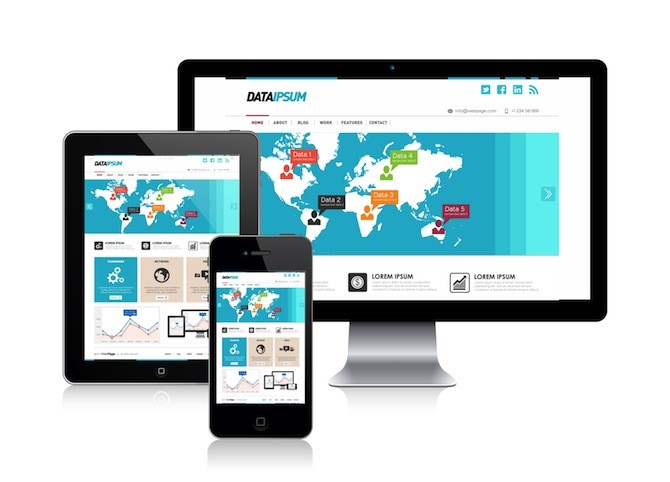
 Using a responsive wordpress theme is the easiest way to optimize your site for mobile visitors. A responsive theme adjusts itself according to the device being used by the incoming visitor. So a visitor from desktop or laptop will see a wide interface whereas mobile visitor will get the interface that fits on his screen without any cluttering. Most of the times, all you need to make your site mobile friendly is just a responsive theme and it is the most popular method for making your site mobile friendly.But it has its drawbacks too, the responsive themes do not reduce the size of images being used and you would have to do this manually for your site to load faster on slow connections of mobile devices. However, having a mobile friendly layout itself is half the work done.
2. Use a plugin
We use wordpress plugins to solve most of our site related issues and there are plugins that can make your blog mobile friendly too. The perk of using a plugin is that you can install and start using it within a matter of minutes. It does not require you to have any knowledge on optimizing sites for mobile. Here are some popular plugins you can use for this:
WPtouch: WPtouch mobile plugin instantly makes your site a mobile optimized, touch friendly website that can be viewed perfectly on all mobile devices. It detects the device of your incoming visitor and provides them the suitable version of your site. You have more options to customize the design according to your taste. The premium version of WPtouch mobile offers even more exciting features like automatic video and photo scaling, support for retina and HD displays, etc.
WP Mobile Detector: WP Mobile Detector plugin can identify if the visitor is using an ordinary mobile phone or a smartphone and it displays a suitable version of your site layout differently for each of them. It can detect and support over 5000 different mobile devices. WP Mobile Detector also provides mobile statistics and comes with 7 built-in mobile friendly themes. The premium version lets you create custom themes and display ads for mobile devices.
Jetpack’s Mobile Theme: This plugin suite brings some features of wordpress.com to your self-hosted WordPress site. It comes with a mobile theme which is snappy and fast loading on mobile devices. The mobile theme will use the design elements from your desktop WordPress theme by default but you can customize it with some simple modifications on CSS.
3. Design a separate mobile version of your site
If you create separate mobile version of your website, you will have two separate websites, a desktop site and a mobile site. The mobile site is usually given an alias like m.yoursite.com and it helps people recognize that they are on the mobile version. When someone visits your site on a mobile device, they get redirected to the mobile site automatically. Having a separate site for mobile users can help you provide different content for mobile and desktop users. You can always control what the mobile visitor sees, and the content on desktop version of your site will not affect this. The only drawback is that you have to make the changes on desktop and mobile sites separately and this will consume more time. Designing a separate mobile version of your website used to require technical skills before, but now there are many services that would help you easily create and host one for free.
How to build the mobile version of your site
You can either hire a developer to get this done for you or follow this simple guide to build one with a free service called dudamobile.
1. Head over to http://my.dudamobile.com and sign up for a free account.
2. Once you create your free account you will be redirected to the dashboard. Click on “Create mobile site’ button over there.
3. In the new popup box, select ‘Use an existing website URL’ and enter your website URL, site nickname and choose the category your site belongs to.
4. Click on ‘Convert’ and you will be presented with the editor page where you can customize the looks of your mobile version. There is a preview panel to the right of the editor. Once you are done with customizations, click on ‘Next’.
5. You will be taken to the page editor where you can add different objects like social sharing buttons and other widgets. Once you have added required elements and everything looks fine, click on ‘Next’.
6. In the next page, you will be asked to select a plan for the service; premium plan has features like ad free site, custom subdomain like m.yoursite.com support and many more. We shall go with the free plan in this tutorial. Select free plan and click on “go live’.
7. As a final step, click on ‘Setup my mobile redirection’ and you will be provided with a JavaScript code which you will have to add on your site. Alternatively, you can search for ‘Mobile Website Builder for WordPress by DudaMobile’ in the WordPress Plugins repository and install the plugin. And voila! You have a separate mobile version of your site now.
To get your m.yoursite.com alias, you will have to upgrade to dudamobile premium.
Things to keep in mind
Using a responsive theme is the best option among all these as you will have less work to take care of. It has to be noted that using free plan of services like dudamobile can have a negative impact as the URL of your mobile site begins with their domain. If you have a blog, it is better to go with the responsive theme or wordpress plugin method rather than creating a separate mobile site. Creating a separate site with m.yoursite.com alias is better if you have a static website where new content is not added very frequently.
Please let us know in the comments below… Do you read a lot of websites on your mobile phone?


David Ford
David Ford is a blogger, writer and web content expert. He loves writing on blogging tips, web designing, SEO, internet marketing and social media management.