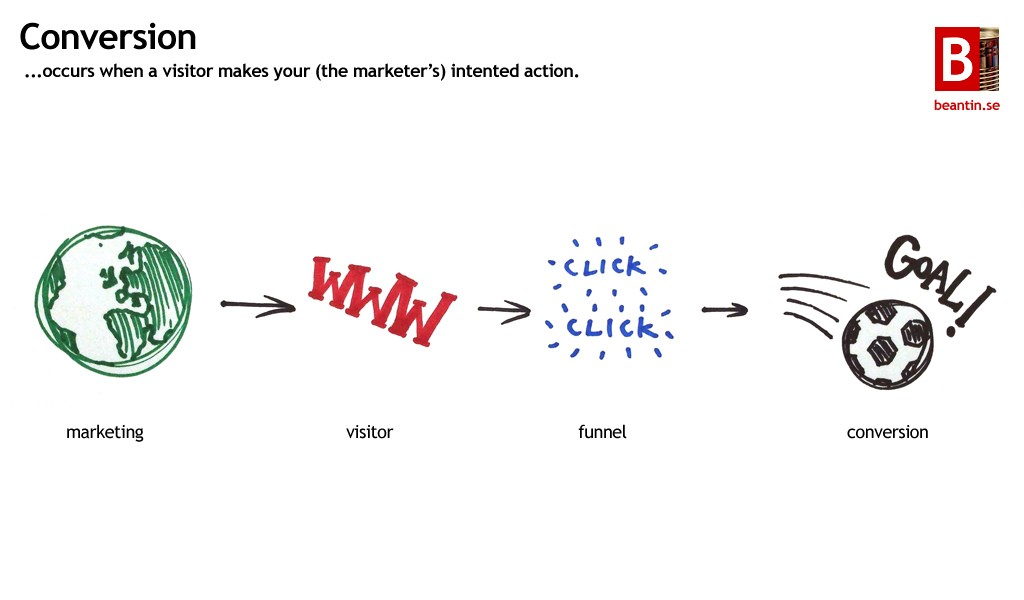
In blogging and Internet marketing in general, conversions are everything. Really.
Just think about it – getting 1,000 visitors a day is great. But if none of those visitors subscribe to your blog, i.e. converts, what’s the point? You might be getting hoards of traffic, but if none of those visitors actually hop onto your mailing list, chances are that you won’t be making any money.
E-mail marketing and focusing on getting people to opt in to your lists is something that will not only boost your credibility and popularity across the blogosphere, but will also bring you revenue. In fact, many Internet marketers (Michael Dunlop, for example) will tell you that 80% of their online income (or more) comes solely from their list.
Clearly, list-building and getting those opt-ins is very important. That said, here are 15 nifty tips to increase your blog opt-in rates from the pros.
1. You Are Giving Something Away, Right?
People are always looking out for themselves. Believe it or not, 99% of your visitors won’t subscribe to your mailing list just because you regularly post high quality content to your blog (even though high quality content is a must). Readers look out for benefits, and what they stand to gain from subscribing to your list.
They need an incentive. An eBook, access to an exclusive interview, or even a subscriber-only membership with subscriber-only content, like what CopyBlogger does.
Make sure that whatever you offer up as an incentive is actually of some sort of value. Don’t just rebrand and give away cheap PLR, or rehash/spin your blog posts and call the conglomeration an “eBook”. Take the time to craft a value-filled eBook or video that your subscribers will love and thank you for.
Additionally, make sure it’s relevant to your niche. If you blog about weight loss, your readers probably don’t want a video tutorial on how to grow petunias.
2. Look Pretty Ugly
I bet you’ve always wanted those “cool” squeeze pages – the ones that look sleek, modern, and very high-tech. I sure know I did in my initial blogging days.
But the truth is, the plain ugly Janes actually convert much higher. “Sleek Sally” squeeze pages don’t even begin to compare to a plain, ugly headline and a plain, ugly background with a plain, ugly opt-in box.
The reason why they work much better is because, ugly as they are, they grab your attention and hold it. Those modern squeeze pages, on the other hand, usually have too much confusion going on and simply don’t engage viewers.
3. Don’t Ask For Information You Don’t Need
People are always hesitant to giving out their information, especially online. For all they know, you’re just another insurance salesman (and they certainly don’t want to give insurance salesmen their home address or cell phone number). And let’s face it – you don’t need either of those details to send someone an eBook. All you need is a verified e-mail address.
If you can go without their first name (and you usually can), then don’t ask for it. Keep in mind that all you need for a sales-generating autoresponder sequence is an e-mail address. Nothing more, nothing less.
4. Add In A Testimonial Or Two … Or Three
If you haven’t noticed, great sales letters often include a bunch of customer testimonials to add as proof the product is legitimate.
If it works for sales copy, then why shouldn’t it work for your squeeze page?
After having secured a few opt-ins, send out an e-mail broadcast as king subscribers to reply to your e-mail address and say whether or not they found the book helpful. Better yet, randomly pick a few e-mails off your list and send them a personal message. If you can get something along the lines of “I can’t believe Mr. X is giving this info away for free!!”, it will sure be a lot easier to get those opt-ins rolling in.
What’s even better is if you can get a testimonial from a widely respected and popular man in your industry (like Darren Rowse in blogging).
5. Channel Your Traffic Into Your Squeeze Page
As soon as any visitor hops onto your blog, you should have one purpose for them – to subscribe to your mailing list. Once they’re on your list, then you can worry about things like getting them to interact with your blog posts and share/link to your articles and perhaps even purchase your (affiliate) product.
With that goal in mind, set up your blog so that it’s just one big funnel channeling all traffic into your squeeze page.
6. Use A Pop-Up/Lightbox Plugin
There’s quite a bit of controversy and debate over whether or not you should add a pop-up/lightbox on your blog. You’ll find die-hard lightbox fans, and you’ll find webmasters out there who are on a quest to eliminate all pop-ups from the universe.
But seriously, there’s simply no denying the fact that pop-ups increase conversion rates. Leslie Samuels reported a 548% overnight increase in subscriptions after installing and activating a pop-up plugin. Syed Balkhi, founder of WPBeginner, increased their subscription rate more than six times over by using their premium plugin “OptinMonster”. Pop-ups are quite possibly the best way to ensure that all your viewers know that you’re giving away something of value in exchange for their e-mail address.
If you’re willing to suffer a bit in the bounce rate department while gaining an increased opt-in rate, then go for a pop-up.
7. Target Your Traffic
Even though most of us probably already realize that all traffic was not created equal, some need it to be reiterated one more time.
Different kinds of traffic from different sources of traffic will get you different conversion rates. If you don’t drive targeted traffic to your blog (in other words, visitors who are actually interested in what you blog about), then you won’t get conversions. It’s that simple.
On the other hand, if you zero in and narrow your focus market down so that every visitor who arrives at your blog is hungry for what you offer in your blog posts, you’ll boost your conversions by a whole lot overnight. Plus, your bounce rate is likely to plummet and your average visit duration and pageviews per visitor metrics are likely to skyrocket.
8. Insert Your Opt-in Form At The End Of Every Post
Right after someone gets through reading one of your awesome posts, they’re looking for what they should do next. Comment? Take a look at a related post? Hit the “exit tab” button?
Why not make them subscribe?
Pat Flynn of Smart Passive Income increased his opt-in rate by 25% when he added an opt-in box at the end of every post as a fresh addition to his new blog design.
9. Be Upfront & Honest
If you’re going to send subscribers daily tips on how to grow their biceps, fine. Tell them that in the squeeze page.
If you’re going to send them affiliate promotions every-so-often for whey protein supplements they’re sure to love, fine. Tell them that in your squeeze page.
Always be upfront and honest in your squeeze page. While telling them they’ll get a few product promotions might not directly increase your conversion rate, it will pre-qualify your traffic. You’ll end up building a much more responsive list that will actually buy products (since they already know that they will get those affiliate promotions) and not just hunt around for freebies.
10. Their Private Details Are Safe With You
Don’t worry. Your details are 100% safe with me.
Going back to the “people don’t wanna give out their private details” theme, make sure that you’re telling your leads that your details are absolutely 100% safe with you. Locked in a vault with the key thrown away.
Also re-assure them by telling them that they won’t see a promotion in their inbox every 3 hours, unlike what they might be getting from most of the mailing lists to which they are subscribed.
11. Add Some Authority Into The Mix
The more weight your name carries, the better.
If you’ve seen The Hobbit (great film, by the way – definitely mark a date on your calendar to watch it soon), then you would have  noticed that whenever the name “Thorin Oakenshield” is mentioned, a certain awe and deep respect is evident in the faces of those in the vicinity. His name is great, his name carries weight, and his name has a stamp of authority across it.
The more authority you wield and the more respect you command in your niche, the more likely people are to subscribe to your blog.
12. Brag A Lot
Have you been featured in a national magazine related to your niche? Tell your visitors. That’s right, stick up a huge header telling everybody where your blog has been featured – the New York Times, MSN, ProBlogger (if you’re in the blogging niche), and in any other written publication that carries a lot of authority.
You’re building credibility for yourself and letting all your visitors know that you’re an expert.
13. Show People Your Face

Photo courtesy Epsos via Flickr.
Fact is, people are much more likely to subscribe to your list and buy from you when they see your face and realize that you are not just a faceless mask behind a computer screen. We all like to be reminded that those we buy from are humans, and not robots.
Keep your profile image professional and neat (NOT your Facebook cover depicting your family’s most recent snowboarding trip). Smile – look friendly and approachable.
In other words, ensure you’re not building a distance between you and your potential subscribers. Instead, you are making a connection with them.
14. Use The Right Color Combination

Courtesy Doug88 via Flickr.
A recent infographic from KISSMetrics showed the effect color has on call-to-action, links, and “buy now” buttons. Different colors schemes fire different brain synapses and convey different feelings and emotions to viewers.
There’s no one-fits-all color for your links and buttons, but HubSpot showed that a red “subscribe” button increased page conversions by nearly 21% when compared to a green button. Think of it! 21%! If you average a fair 20 subscribers a day, that’s an extra 7000 subscribers per year – just by changing the button color!
15. Test, Test, And Re-test
If your squeeze page isn’t converting well, change it around and test the results of the new page versus the results of the old one. Pick the winner.
Then test again. And again…until you’ve got your squeeze page converting at a healthy 30+% percent at least.
Good old-fashioned split-testing can get you miles closer to where you want your blog to be.
Summing Up
Just to recap:
- offer a free incentive, and make sure it’s displayed everywhere (especially at the ends of posts)
- choose “plain Janes” over “Sleek Sallys”
- don’t ask for information you don’t need, and keep their details private
- use a pop-up if you’re willing to risk the bounce rate and overall user engagement
- add in a testimonial … or two … or three
- target your traffic
- be upfront and honest
- be authoritative
- be human
- think color psychology
- and above all, split-test till the cows come come
With these fifteen tips, you’re well on your way to a high-converting blog that brings you subscribers, sales, and ultimately, revenue.
Psst! While you’re at it, why not take a look at our squeeze page and take a few leaves out of our book?
*Featured image courtesy Beantin via Flickr.


